Comparison report
From TQAuditor Wiki
Comparison report page: http://cloud.tqauditor.com/comparison/index?id=XXXX (replace XXXX with a valid number)
At this page, you can compare the original and amended translation.
Note: To add mistakes, please go to the Evaluation report.
- View in translated - only source and original translation are displayed:
- View in reviewed - only source and amended translation are displayed:
If you want to add a mistake, go to the Evaluation report.
Buttons and filters
At the left side of the screen, different buttons and filters are displayed:
- Complete evaluation - the button, that finishes evaluation process.
- Evaluation report - evaluation report view.
- Delete evaluation report - deletes the evaluation report.
- Comparison report - comparison report view.
- Project details - basic information about the project.
- Project files - original and amended translations.
Markup display
Markup display option defines tags display:
- Full - tags have original length, so you can see the data within:
- Short - tags are compressed and you see only their position in the text:
- None – tags are totally hidden, so they will not distract you:
Units display
- All units - shows all text segments:
- With corrections - shows nothing but amended:
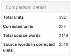
Comparison details
Also, you may find here Comparison details, such as:
- Total units - the total number of segments.
- Corrected units - the number of segments with amendments.
- Total source words - the total number of words in the source.
- Source words in corrected units - the number of source words in amended segments.
