Difference between revisions of "Comparison report"
From TQAuditor Wiki
(→Export to Excel) |
Aleksandra.d (talk | contribs) |
||
| Line 1: | Line 1: | ||
| − | |||
| − | |||
| − | |||
| − | |||
On this page, you can compare the original and amended translation. | On this page, you can compare the original and amended translation. | ||
| − | <span style="color: | + | <span style="color:red"> '''Note:'''</span> To add mistakes, please go to the '''Evaluation report'''. |
[[File:comparison report features.jpg|border|1200px]] | [[File:comparison report features.jpg|border|1200px]] | ||
| Line 23: | Line 19: | ||
=='''Buttons and filters'''== | =='''Buttons and filters'''== | ||
| − | + | On the left side of the screen, different buttons and filters are displayed: | |
[[File:Evaluation report buttons.jpg|border|250px]] | [[File:Evaluation report buttons.jpg|border|250px]] | ||
Revision as of 17:49, 9 April 2020
On this page, you can compare the original and amended translation.
Note: To add mistakes, please go to the Evaluation report.
- View in translated - only source and original translation are displayed:
- View in reviewed - only source and amended translation are displayed:
If you want to add a mistake, go to the Evaluation report.
Contents
Buttons and filters
On the left side of the screen, different buttons and filters are displayed:
- Complete evaluation - the button, that finishes evaluation process.
- Evaluation report - evaluation report view.
- Delete evaluation report - deletes the evaluation report.
- Comparison report - comparison report view.
- Project details - basic information about the project.
- Project files - original and amended translations.
Markup display
Markup display option defines tags display:
- Full - tags have original length, so you can see the data within:
- Short - tags are compressed and you see only their position in the text:
- None – tags are totally hidden, so they will not distract you:
Units display
- All units - shows all text segments:
- With corrections - shows nothing but amended:
Export to Excel
You may export the report to Excel by pressing the "Export to Excel" link in the upper right corner of the report:
You will have the fixes in columns for comparing.
Please note that the rows with corrections are highlighted in red:
Note: If you apply the Units display filter, only the filtered data will be exported.
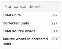
Comparison details
Also, you may find here Comparison details, such as:
- Total units - the total number of segments.
- Corrected units - the number of segments with amendments.
- Total source words - the total number of words in the source.
- Source words in corrected units - the number of source words in amended segments.
