Comparison report
From TQAuditor Wiki
On this page, you can compare the original and amended translation.
Note: To add mistakes, please go to the Evaluation report.
Contents
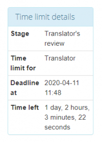
Time limit details
Here you can see time limit details:
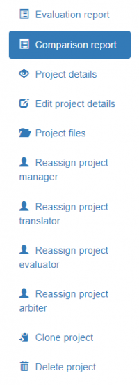
Buttons and filters
On the left side of the screen, different buttons and filters are displayed:
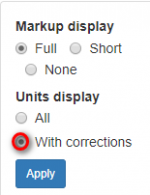
Markup display
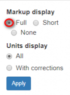
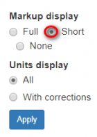
Markup display option defines tags display:
- Full - tags have original length, so you can see the data within:
- Short - tags are compressed and you see only their position in the text:
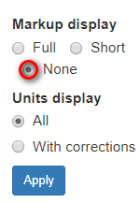
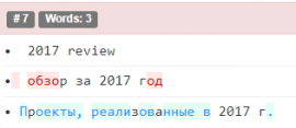
- None – tags are totally hidden, so they will not distract you:
Units display
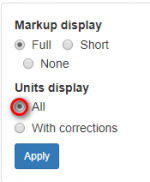
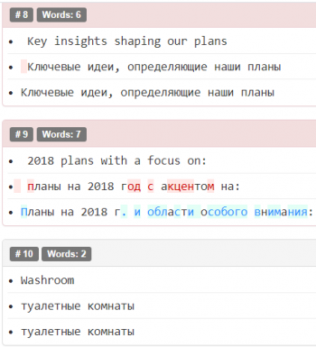
- All units - shows all text segments:
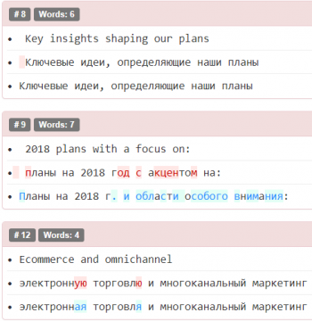
- With corrections - shows nothing but amended:
Comparison details
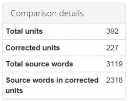
Also, you may find here Comparison details, such as:
- Total units - the total number of segments.
- Corrected units - the number of segments with amendments.
- Total source words - the total number of words in the source.
- Source words in corrected units - the number of source words in amended segments.
